This series takes you behind the scenes of 20sPeople – a season of exhibitions, activities and events from The National Archives that explores and shares stories connecting the people of the 1920s with us in the 2020s.
In the final instalment of our behind the scenes series, we speak to Sarah Ahmed, Senior Marketing Officer, about the branding of our 20sPeople campaign and all the creativity that went into it.
Read on to discover how the campaign came to fruition, including the inspiration for the imagery used, how we chose the name, and why everything was pink…
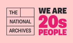
20sPeople Programme and Campaign Logo alongside The National Archives’ logo
Who was involved in developing the design concept for the 20sPeople programme and campaign?
The 20sPeople programme itself was led and coordinated by the Marketing and Communications department. We brought together stakeholders from a variety of teams across the organisation to explore what we wanted the campaign to say, and how we could say it.
As part of that process, we created the 20sPeople concept and developed a design brief for the campaign’s visual identity.
What were the key things you wanted the branding to do?
We knew that it needed to promote the 1921 Census and complement (rather than compete with) Findmypast’s promotional campaign, but we also wanted to raise awareness of The National Archives and our 20sPeople programme, including the exhibition. This was the first major campaign since our 2019 rebrand, which had provided us with a new logo, new colour palette, new graphics and so on – the campaign would be a brilliant way to showcase that.
It was quite a complex programme, with a mix of online content and on site activities, so we knew we needed one consistent brand experience to link everything together. In particular we wanted to catch the attention of and appeal to new audiences; our audience typically skews more on the research side and demographically a bit older, so a key aim was that this campaign reached out to younger and more diverse audiences.
How did you come up with the 20sPeople concept, and what did you hope it would achieve?
We held a workshop to look at what we wanted the campaign emphasis to be, concluding that it should focus on people’s stories to make the most of the link back to the 1921 Census.
From there, we voted out of the top options and 20sPeople was chosen.
For the themes that 20sPeople would cover, we wanted it to draw relevant parallels and contrasts between then and now, specifically focusing on striking parallels such as recovery from a pandemic, technological change, cult of celebrity, changes in rights and issues affecting marginal groups, unemployment, global politics, the British empire.
It’s about changing perceptions. Thinking about people then and people now, the campaign looks at what surprising connections there are between the two.
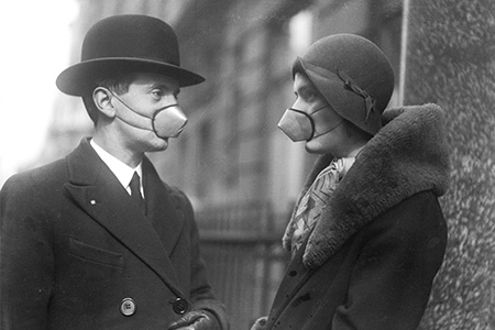
Photograph of 1920s man and woman, wearing face masks
What were the key objectives for the campaign?
The reason why we thought the 20sPeople concept worked was because it drew a direct connection between the people of the 1920s and the people of the 2020s, making it instantly relevant – this isn’t just history, it matters today.
It’s about identity and what we can learn about ourselves, and people generally love things about themselves! They might not say that they do but it’s often what it comes down to – anything that makes a link to the self can be very compelling.
Inclusivity was also a huge objective for the campaign. One of the problems with the 1921 Census is that it’s very limited in appeal to those living in 2020s Britain without family who were living here in 1921. We really wanted this campaign to tell people’s stories in a way that was relevant and interesting to everyone, so the beauty of 20sPeople is that it instantly brings people together as we’re all 20sPeople.
What was the process for deciding the visuals of the branding, and where did the pink come from?
Once we’d had the workshop and had a direction on the name and a brief, we started looking for designers who had worked on really transformative campaigns with other cultural institutions.
Once we’d appointed a designer with a great track record and briefed them on the project, they presented us with different creative directions for the campaign. We talked about how the design could help us achieve the campaign objectives, as well as how it would work with The National Archives’ brand. We were also very keen to steer clear of certain tropes, such as the Americanised view of the Roaring Twenties. It was a very bold decision for us to choose a photographic route, as one of our biggest challenges is the limitation of our collection, as vast as it is – the majority of our records are written documents. However, faces perform really well in advertising and marketing campaigns because people can relate to them and they’re very striking – we thought it was a really strong route so we really wanted to see how we could make it work.
The light pink is one of our brand colours – we wanted to use it because it’s potentially a bit unexpected from us! We found in testing that it resonated really well with new and younger audiences, and even those people that didn’t necessarily love it did notice it – as a marketer that is exactly what I’m trying to achieve!
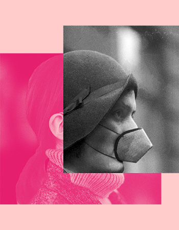
Programme marketing image for ‘We are healing’ using the 1920s photograph of a masked woman, on top of a modern-day image of a woman
Did the campaign branding present any challenges?
Our biggest challenge we had was finding diverse photography from the 1920s, from other collections as well as our own. We tried really hard to source representative imagery of people from different ethnic, socioeconomic, and regional backgrounds. One area where we really succeeded with that was 20 People of the 20s – it was a great way to show a range of stories of people of different occupations, regions, ethnicities, genders, sexualities. However, more generally it was hugely more difficult. One flaw of the photographic approach was that most of the images of people in the 1920s were people who could afford to have photographs taken and therefore tend very much to be of people who were quite privileged.
Another challenge early on was working out how much we wanted to focus on 1921 itself, versus the 1920s more broadly. Obviously we have the 1921 Census as our cornerstone, but that’s quite limiting. This very much informed our choices when it came to naming the programme and the exhibition.
Another obstacle we had when deciding on the name was that some of them sounded like they were talking about people in their 20s. For example, one of the names we considered was 20s Life – I did some research on social media and found that people were using #20slife on posts talking about being in their 20s, like doing their washing for the first time, so that one was cut pretty quickly!
People have certain expectations of archives which is a bit of an engagement barrier for us anyway, so we did have to think about if we wanted it to mention archives or the census in the campaign title – as we wanted to reach out to as wide an audience as possible, we decided not to include these words. This also helped ensure that we would not clash with Findmypast’s marketing campaign for the 1921 Census, which we were also closely involved in developing.
What has been your favourite part of working on the campaign?
Ooh, I have two! First was coming up with the name – it felt like everything clicked into place. I suggested it towards the end of the workshop and it felt very right, even if I do say so myself.
The second moment was receiving the different creative routes for the campaign, I don’t want to sound cheesy but I did get a real shiver down my spine looking at them and thinking ‘wow, this could be really exciting and something to be really proud of’. This has been the main project I’ve worked on since joining The National Archives last year and it has been brilliant to work on something I’m so passionate about whilst putting my own stamp on it.
Find out more
Read about the making of our recent exhibition, the 1920s: Beyond the Roar: https://www.nationalarchives.gov.uk/20s-people/the-making-of-20speople-the-1920s-beyond-the-roar/
Read about the making of our audio drama series, Once British Always British exploring the experiences had by those who came to Britain in the 1920s from elsewhere in Britain’s empire: https://www.nationalarchives.gov.uk/20s-people/behind-the-scenes-once-british-always-british/
Read about the making of our new video series for our newest social media channel, TikTok as part of the programme: https://www.nationalarchives.gov.uk/20s-people/the-making-of-20speople-tiktok/