Palaeography is the study of old handwriting. This web tutorial will help you learn to read the handwriting found in documents written in English between 1500 and 1800.
At first glance, many documents written at this time look illegible to the modern reader. By reading the practical tips and working through the documents in the Tutorial in order of difficulty, you will find that it becomes much easier to read old handwriting.
This tutorial has been developed in partnership with the School of Library, Archive and Information Studies (SLAIS), University College London
This resource has been archived as the interactive parts no longer work. You can still use the rest of it for information, tasks or research. Please note that it has not been updated since its creation in 2005.
You can find handwriting on to practice on in our other resources:
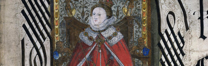
- Elizabeth I’s monarchy
Rule of a ‘weak and feeble’ woman? - English Reformation c1527-1590
How did state and people respond to religious change? - James I
What were the key areas of dispute?