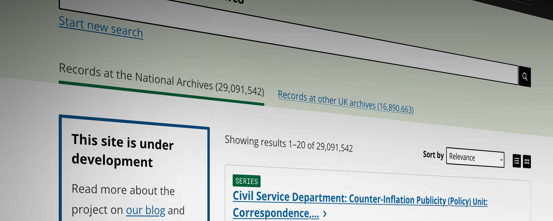
In this blog we’re going to delve into the design of our new catalogue. Launched as a Beta (a first version that we’re still working on) at the end of 2025, it’s the first major release of what will eventually replace Discovery, our current catalogue, to deliver a more modern, robust and secure service for our users.
When Discovery first launched over a decade ago, it set the standard for archival searches. However, in the intervening years the needs of users visiting The National Archives’ website have changed as has the internet itself. What worked ten years ago no longer meets our users’ expectations, especially with the prevalence of mobile devices and emerging technologies such as AI.
This new catalogue has been a long time in the making, part of a multi-year commitment to building a new website for The National Archives from the ground up. Our catalogue is vast, containing 37 million records and counting. Designing such a complex and unique service has been a huge challenge for the Digital Services team. From the earliest experiments (under the banner of Project Alpha) to its current Beta, the catalogue has seen many iterations in both design and functionality.
Digital blog
Welcome to the new National Archives online catalogue!

We want to bring the archives to everyone, and as the first step towards that goal we’ve worked on making the online catalogue more accessible and inviting.
Putting users first
Designers in the Digital Services team follow the Government design principles. As such, design always starts with user needs. This means key decisions on presentation, functionality, and usability are informed by user research and data. For the first few iterations, we have focused on the needs of new users and those unfamiliar with archives.
Before beginning work on the new catalogue, we gathered a wealth of feedback from our users, to identify the most urgent areas for improvement. The user interface (UI) in particular was considered outdated and cluttered, which many users found overwhelming, as well as being inaccessible to some and incompatible with mobile devices. For many, Discovery was an ‘academic tool’, intimidating to those unfamiliar with archives and archival terminology.
For the new catalogue we’ve worked on a modern, cleaner, more spacious design. The search results have been given more room to breathe, and the individual record pages make use of modern techniques such as progressive disclosure. This technique allows the primary information to remain visible while secondary information is hidden until it is needed.

An example of how progressive disclosure is used to present a large volume of collection filters, used to refine searches.
Throughout its evolution we’ve tested the UI with a wide range of users, from first time visitors to experienced researchers, and refined the design with each new iteration. The result, we believe, is a less busy, more focused presentation of archival descriptions that appeals to our millions of users.
Displaying search results
Image 1 of 2

Search results from our new catalogue.
Image 2 of 2

Search results from our current catalogue, Discovery.
Visual improvements
An example of how we’ve improved upon the presentation of key information is the hierarchy. The hierarchy indicates the position of the current record in the catalogue, whether in a series or at another level.
In Discovery, this is presented at the top of the page as a tree of cascading links. From user research it was clear the hierarchy is often conflated with navigation links, and as such users can quickly become lost and disorientated.
User research showed that people were more inclined to look at the hierarchy after they had read the record information, so in the new catalogue we’ve moved the hierarchy down the page. Making use of that additional space, we’ve used colour to visualise the hierarchy in a more graphical way. From here users can navigate the next and previous record easily, as well as get a sense of how deep they are in the structure of the catalogue.
Displaying hierarchy
Image 1 of 2
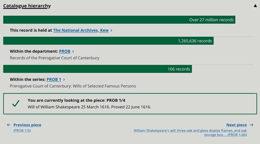
The hierarchy as it appears in the new catalogue.
Image 2 of 2
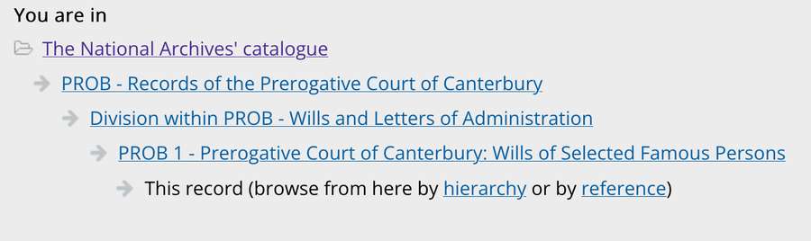
The current hierarchy in Discovery.
Feedback suggests this approach has been well received and aids in understanding the complex structure of the catalogue.
Access for all
We take accessibility very seriously in the Digital Services team. The National Archives is for everyone, and we want all our users to enjoy the new catalogue regardless of their ability and the device they choose to access it.
By taking an accessible first approach we’ve designed the new catalogue in accordance with WCAG 2.2 guidelines (the internationally recognised set of recommendations for improving web accessibility) to make it ‘perceivable, operable, understandable and robust’.
In real terms, this means that the visual, interactive, and functional elements are designed to be clear and simple to use and hopefully don’t get in the way of the important business of finding records.
A consistent approach
Many of the patterns, styles and components used in the new catalogue (and across the new website) are described in The National Archives Design System. A Design System is a framework of standards, best practice and guidelines, and day-to-day it helps designers and developers build consistent services. It covers all aspects of design, from the use of colours and images to components such as lists and forms.
The National Archives has its own visual identity, which reflects its position in the heritage sector. This branding is reflected across the website in the use of elements such as images, colour and typography.
You’ve probably noticed that light green is now the signature colour across our new website. Green is perceived as harmonious and is believed to aid concentration. This is especially important for users who might spend many hours researching family or reading detailed documents.

An example of colour and typography used in the new catalogue: The will of William Shakespeare, catalogue reference: PROB 1/4
The choice of typography is always a key consideration in design. Fonts need to be readable and work across a wide range of devices. We use Supria Sans Condensed for headings and Open Sans for content. Both of these are highly legible typefaces, designed for web, print and mobile devices.
Looking ahead
This is the first phase of building a replacement service for Discovery, so the new catalogue does not yet have all its features in place. Some key features we're currently researching and designing for the new website include Advanced Search and Browse.
Stay tuned for more information about new additions to the Beta catalogue in the coming weeks and months.
Search
The National Archives' online catalogue
Take a look at the new online catalogue and see some of the new features.
Have your say
We’re in the process of rigorously testing the new catalogue, and your feedback is incredibly valuable to us. It helps us identify what works and what needs improvement.
So, if you can spare us a few minutes, please fill in the feedback survey below and share your thoughts. We look forward to receiving your feedback about the new design.
Help us improve our new catalogue.