The button component is usually included in every design system, User Interface (UI) toolkit and pattern library. In a world of digital devices, it’s the thing we probably interact with most often, sometimes hundreds or even thousands of times a day and has functionally remained largely unchanged, right the way back to the earliest computers with a graphical user interface (GUI).
First steps
We started by looking at the various different buttons that had been created for the new National Archives website and it was clear that there were more than just a few variations. We needed to standardise.
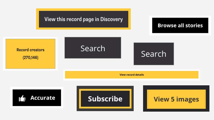
Various buttons from across our beta site.
A button can have many uses. For our purposes, we needed to break the button down into two types: a button link and a button element. The button element is what is used to submit data in an online form. A link is just a glorified textual link to another web page. To a user, we didn’t feel there was much value in them looking any different from one another.
With all the different styles, it was clear that we needed some flexibility in our button component without losing the idea of what a button should look like. Once a user learns about our buttons, that knowledge should translate across our whole digital estate.
Our button should be simple and clear so we started with the simplest option – a plain, black rectangle with white text. A good start. White text on a black background made for as much contrast as possible and the black button contrasting against the mostly-white web pages
Our primary font is Supria Sans Condensed which we use across all signage in our building. It is quite a narrow font which means a button has the potential to contain more text but at the cost of readability.
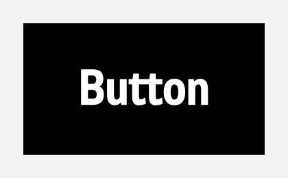
The button with text in Supria Sans Condensed.
We opted instead to use our secondary typeface, Open Sans, which is the same as our body text but a heavier weight to help separate it out even more from other text. As there is no guarantee that users will be able to load Open Sans, we also had to make sure the button looked fairly good when using the default sans serif font that comes with various operating systems. As much as possible, we balanced the space around the text to be even which gave a pleasing but focused aesthetic.
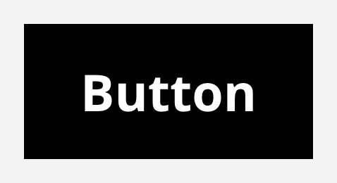
The button with text in Open Sans.
Interactive states
A button should be able to indicate to you that you are interacting with it. The most noticeable interaction should probably be the hover state.
We wanted to make it really obvious when you are hovering over a button and the biggest visual change we could make was to invert the colours. The issue with this was that changing to a white background would destroy the contrast we had with the page.
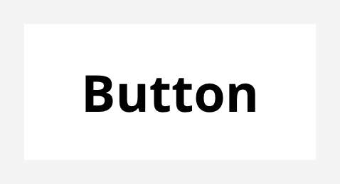
The white button inverted.
Needing to retain the visual aspect of where the button “went” so users wouldn’t lose their place, we opted to add a border to hovered buttons and let the background of the button become transparent which gave a much more pleasing look.
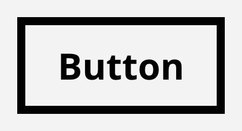
Now with a border.
This approach also gave us a change of shape which is a great help to users with low vision or who can’t perceive colour. The button clearly changes style when hovered, even if you removed all colour, reduced the contrast and blurred the screen.

A simulation of how someone who is visually impaired might see four buttons in a row with the second one hovered.
It is also helpful to show when a user is focusing on a button. This is especially true for people who navigate websites using their keyboard. Showing a focus state is also a requirement of WCAG (Web Content Accessibility Guidelines) that we need to follow in order to meet our obligation to make accessible websites. We felt a thick, blue border was distinctive enough to show this.
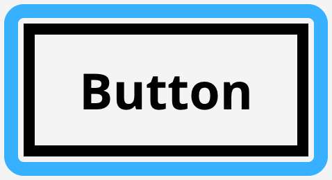
The button when focused.
When focused, we ensured that the button adopted the hover state as well so that even when the blue border didn’t offer enough contrast with the background to show focus, the change of shape would.
Icons
Including icons in buttons was a divisive subject. Some people liked having icons to reinforce the button action and some preferred plain text and buttons that weren’t “cluttered” with graphics.
Our design system simply states 'Use icons sparingly to reinforce call to actions'. Icons are an option in our buttons but we try to limit their use. If adding an icon to a button makes it stand out then by adding too many, we risk visually overloading the user.
...and when everyone’s super, no one will be.
Syndrome, The Incredibles (2004)
The icons we use are from Font Awesome which was chosen because it is free, open source and we have the ability to host the icons ourselves if needed. They are simple, widely recognised and monochromatic which makes them a great choice when using them in our button elements.
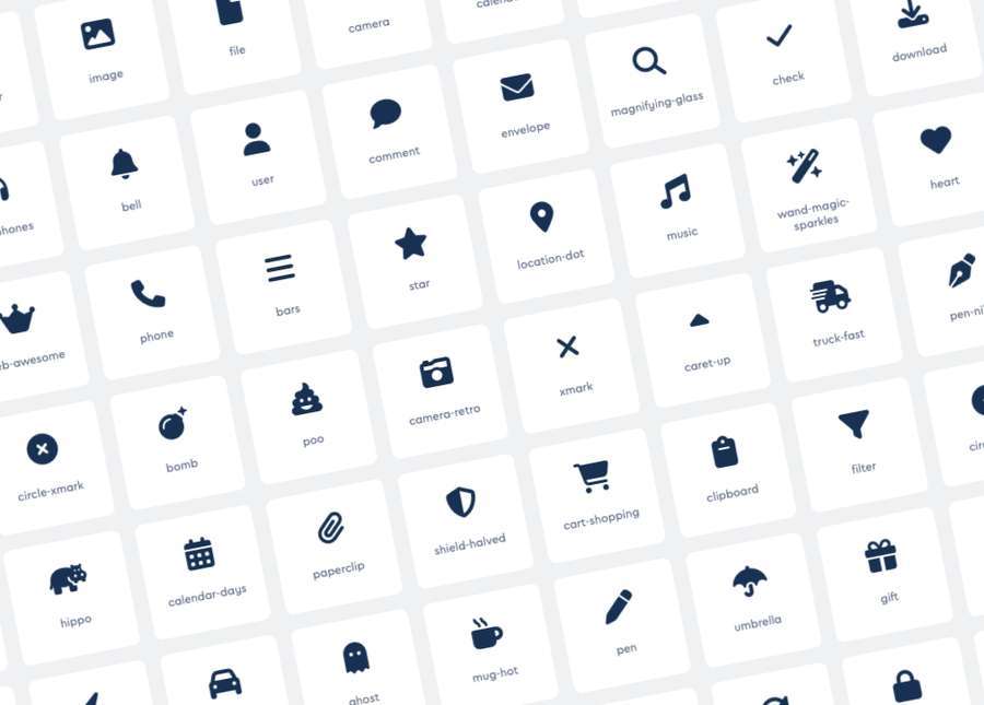
An example selection of icons from Font Awesome.
In rare cases it might be desirable to have a button that just has an icon. In these instances, we need to be sure that the button could be understood. When icon-only buttons are used we need to make sure that the button still has text, even if that text is not visible. This is so that people who use screen readers can still understand what clicking the button will do.
Variations
The National Archives has a number of brand colours which we were keen to integrate into the site. We chose black for the default button background colour not only because the contrast worked well on most pages but also because it should work well with all our other colours.
We also produced a style of button that could take on the accent colour of the page or section that it was in. This helps when we have too many buttons or need to draw more attention to a certain button. The buttons were also designed to work on dark or coloured backgrounds, always ensuring sufficient contrast.
In the same vein, we gave the option for a plain button for secondary actions so that users wouldn’t suffer choice overload. These buttons are designed to look like links but are designed in a way that they can be used inline with other buttons.
We created button groups to contain multiple buttons and keep them aligned which helps with reader comprehension. When working with interactive elements, we have to ensure that they don’t sit too closely together. This is another measure of success for an accessible website. A smaller button variation was also designed for use in scenarios where limited space was a factor.

The final suite of buttons.
At this point, we now had enough variation to cover the scenarios we needed.
Final touches
According to folklore.org, when designing Apple’s first GUI on the Apple Lisa, Steve Jobs asked the engineer Bill Atkinson who was working on the project, to add rounded corners to the rectangles that he was rendering out on screen. ‘Rectangles with rounded corners are everywhere!’ Jobs said, and so for years afterwards, Apple interfaces always had rounded buttons.
The final touch we made to the buttons once all variations had been designed was to ever so slightly round our corners. Square buttons are perceived as more formal than rounded buttons and so they can sometimes appear scary and impact the user's confidence.
No corner radius and the buttons could look too raw and intimidating. Too much and they could look unprofessional and “fun”. Wanting to sit somewhere in between professional yet friendly, we went with a small but noticeable border radius.

The button now with rounded corners.
The future
We are quite confident that this is not the perfect button. As we do more testing with more users and put more new services through accessibility audits, we will learn more about how we can tweak the button component to improve it further.
The benefit that we now have after going through the process of standardisation is that when we want to make a change, we only have to do it once!
The National Archives Design System
Learn more about our buttons on our design system.
